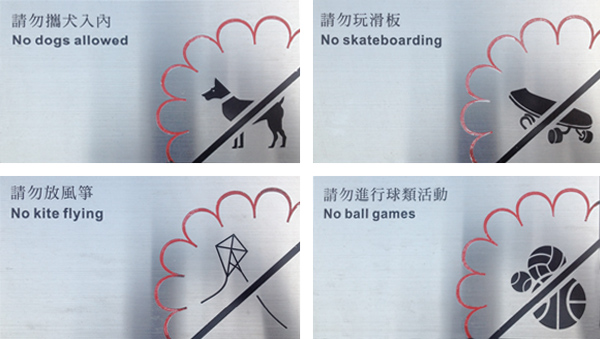
We’re not sure what else there is to do in a park. Seen in Hong Kong, these ‘don’t do that’ signs really take the fun out of a park visit. We assume you can still sit on a blanket and read a book.

We’re not sure what else there is to do in a park. Seen in Hong Kong, these ‘don’t do that’ signs really take the fun out of a park visit. We assume you can still sit on a blanket and read a book.
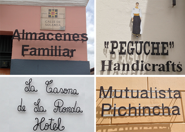
Ecuador’s capitol city, Quito, has one tough commercial sign code. In the historic central district the only signs allowed are cutout black letters, mounted directly to the wall. No sign panels, frames, backgrounds. No color and certainly no neon or inner-illumination. So, pure expressions of typography are seen everywhere. And,… Read more »
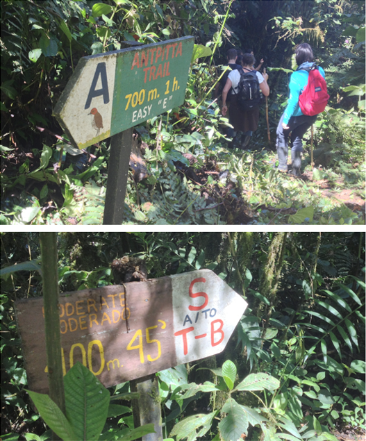
Interesting and effective trail signage in the Cloud Forest high in the Andes in Ecuador. Dealing with the same issues as trails everywhere, these handmade but informative signs show the trail name, destination, hike distance, expected time and difficulty factor. Such information is critical here as the dense rain forest… Read more »
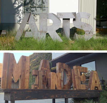
Sometimes a sign needs only letters – no actual sign panel. Think Hollywood Sign. And these sets of large letters not only provide identification, they lend an artistic, even sculptural feel to the streetscape. Armory Arts Center and Cisco Home, both in Pasadena
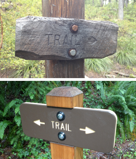
Same size. Same message. Different character.
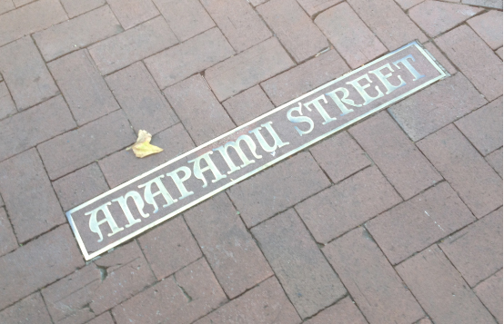
Santa Barbara, California is a great place for many reasons – historic architecture, terrific beaches, wonderful downtown, perfect weather, etc. But, sometimes it’s the little details that catch the eye. Like the elegant bronze street name signs in the pavement at each of the intersections along famous State Street. In… Read more »
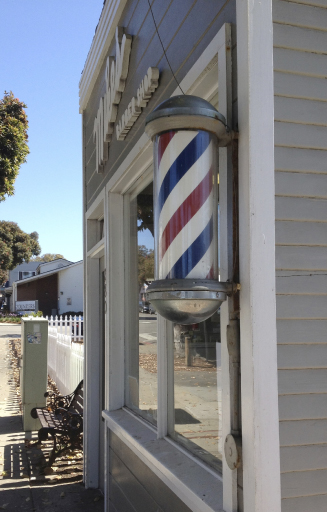
Evolved from surgical signs dating back to the Middle Ages, the striped barber pole is recognizable on thousands of barbershops around the world. Whether spinning, static or even flat, the red, white and blue diagonal stripes signal a specific service.
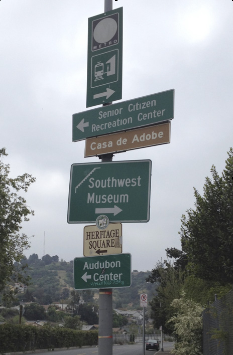
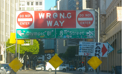
A great example of out-of-control city signage. Six mismatched signs, all clinging to a single light pole. Different fonts; different font sizes; mismatched arrows; random sign panel sizes; haphazard installation. If there was ever a case for an organized city wayfinding program, this is it.
While we frequently point out our favorite signs, we also feel the need to expose the not-so-good. Here, to communicate that Ninth Street becomes one-way east, the City has erected this ungainly traffic control/guide sign right in the middle of the street. Stickers, vandalism and damage don’t help the situation…. Read more »