Category: Branding

‘European’ Signs

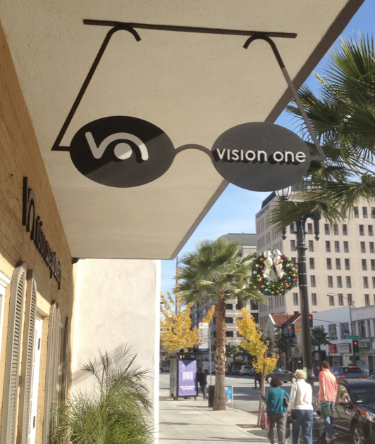
Early merchant signs, especially in Europe, often featured objects or icons hung over the walkway. These ‘picture’ signs had few if any words, depending instead on images of the goods or service being offered to attract customers. The principle still works today as seen in this handsome optometrist sign in… Read more »

First a Sign; then Streetscape Icon; Now Art

Designed around 1900 by architect Hector Guimard, this art nouveau subway design has been defining Parisian streetscapes ever since – over 80 of these elegant gateways survive. This original example now holds court in the sculpture garden at the National Gallery of Art in Washington, DC, sharing the stage with… Read more »

First News Racks. Now Shipping Drop Boxes.

Joining out-of-control newspaper racks on our crowded sidewalks is a new clutter source — branded shipping stations. Usually seen inside office building lobbies, these ungainly and messy-looking drop boxes are popping up in the public way. More unregulated commercial mess on our streets. And, are Fedex, et al paying lease… Read more »

Type on the Go

In this era of digital printing and dynamic messaging, the simple picket sign still manages to attract attention and deliver eye-catching content. Made from inexpensive materials, the signs can be produced quickly and scaled to fit any message. The objective is to deliver a message that will not be eclipsed… Read more »

Sticker Shock

Graffiti is bad and deservedly gets its share of public shame, and, hopefully, legal penalties, but what about those awful stickers? The self-adhesive promotional stickers handed out at clubs, skateboard shops and music stores have become a new kind of urban blight. Ironically, the slacker kids that stick them on… Read more »

Light Rail? What?

Right out of the government sign manual, this sign is a good example of a failure to communicate effectively. What is light rail anyway? Is there a corresponding sign for heavy rail? Light Rail is an engineering or planning term, usually meant to distinguish aboveground urban commuter trains from belowground… Read more »

City Practice Versus City Intent

The City of Ventura sign code prevents this local cafe from using an existing signpost and panel to advertise its little shop. Like many cities, Ventura often restricts the size of a sign to be commensurate with the shop it represents. Likely, this sign was built prior to a city code barring… Read more »

No Place for a Flag

There are a lot of great and appropriate places to display our national flag, but stenciled on a curb is not one of them. The “flag should never touch the ground” concept is pretty much obliterated by the well-meaning, but ignorant companies that will, for a donation, gladly stencil your… Read more »

Sign Spinners

Talk about your animated signs! We often say that a human being is the best directional sign. Here, we get a sign and a person. And we get motion – real human powered animation. Occasionally annoying, but often entertaining. And so far, the sign codes haven’t figured out how to… Read more »

Color in the Marina

Small bits of animated color add much to any environment. Color provides depth, definition and drama to otherwise neutral vistas. Color is counterpoint and contrast. Take out color and the resulting monochrome scene is just not the same.