
Wayfinding for Skiers
The many ways down.
January 31, 2019
You stand carefully on a slippery mountain top staring at an 8 foot-square map sticking out of the snow on 6×6 posts showing four mountains, 58 ski runs and 21 ski lifts. It’s 19 degrees out with light snow flurries and through your fogged up goggles you try to pick an interesting but safe route down to the lodge. First, as on any map, where are you now? Let’s see, there’s the Silver Strike lift on the left and there it is on the gigantic map. Okay, you are here on the map. Now what? Should you head down Lost Boulder and left onto Lucky Star then right at Hawkeye? Or blast down Sidewinder and cut through the trees onto Bluebell? Are there signs along the way? If not, you might miss a turn and find yourself in an unplanned steep-and-deep situation. Sounds like some wayfinding is needed.
A word about ski maps. These beauties are idealistic (I did not say realistic) illustrations of highly complex topographic behemoths (mountains) with canyons, bowls, hidden gullies, ravines, steep and flat areas, false summits and all of the other sculptural and geological forms that make a majestic natural wonder. And at major western ski resorts the mountaintop elevation can be up to 3,500 ft.(!) above the base lift. So imagine trying to depict this physical complexity on a flat two-dimensional map. Now include the dozens of ski trails and lifts, with labels, and you have a real map design challenge. Also, you need to design it to fit on a pocket-size paper version as well.
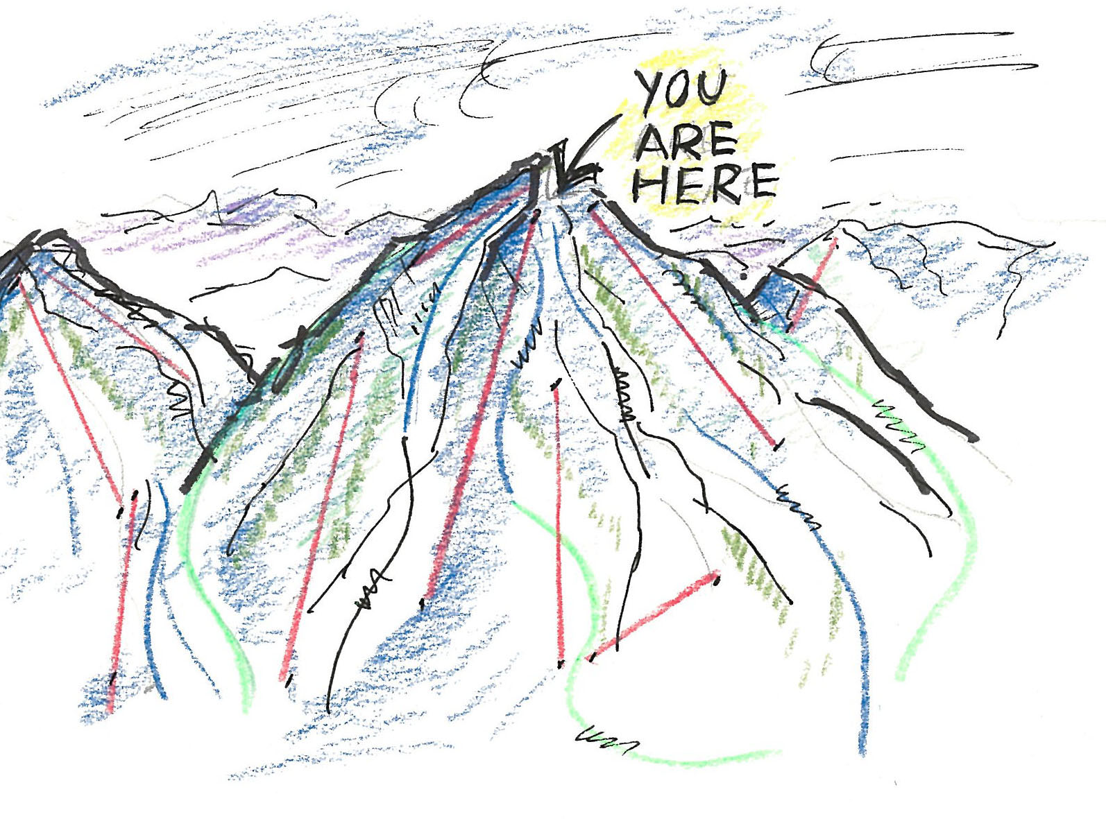 Over the years ski areas have refined the art of ski maps, making them similar in approach and unifying visual language: a slightly simplified and flattened out illustration of the mountains in blue tones with exaggerated white sunlit areas to help lend a three-dimensional feel. Trees are illustrated in green and are mushed together in clumps, adding some pictorial reality. The ski runs are kind of erased out of the picture, not unlike the way the trails were originally cut into the mountain by erasing the trees. Reinforced by an appropriately colored green, blue or black line, each trail is labeled in black or color-coded type. Usually the lifts are depicted in straight red lines, running as they do in reality, straight up the mountain. Sounds messy and complex, but the visual language works pretty well, both on hand-out pocket maps and the massive top-of-mountain displays. And it’s the same at nearly all ski resorts.
But, as we know, the names of things are often critical to successful wayfinding. So, before you select a route, consider the colorful and often apt names of ski trails. Such descriptive nomenclature gems as Naildriver, Doom & Gloom, Elevator Shaft, Kill the Banker, Wildcat, Log Jam, Gun Barrel and don’t forget Widowmaker – you get the idea.
Ready to make your down-mountain wayfinding plan you look for a combination blue runs, avoiding the expert black slopes and the easiest-way greens. Yes, in a great example of universally understood color-coding, degree of difficulty is conveyed in a simple color system of green, blue and black. Reinforcing the colors are equally simple but expressive shapes: the pointed and arresting black diamond, the stable blue square and the friendly green circle. So, trail signs need only note the run name and the appropriate colored shape. Beautiful minimalist communication. Some resorts have refined the approach, indicating double black diamond runs (super steep) and double blue (extremely intermediate?) — I have not seen any double green runs (not quite as easy?). Regardless, an excellent wayfinding approach, seen and understood by skiers around the world.
The actual wayfinding signs can vary widely but are usually minimal—ski trail name on a metal panel bolted to a treated 4×4 fir post. Just the trail name and appropriate icon shape—diamond, square, circle. Easy to miss if you are cruising by at 20 mph on your tuned parabolic skis, especially on open wide runs. Directional signs are few, seen mainly at the top of the mountain and at intersecting trails. The biggest signs on the mountain are the huge letters SLOW stenciled on plastic fencing near the bottom of all major runs – here the green, blue and black skiers merge together, just like cars where the 405 meets the 101 in Los Angeles.
Now you’re ready to let ‘er rip and rock and roll down the mountain. That mocha with whipped cream by the fire is just a few deft swooshes away.