
Which way to the meatballs?
April 15, 2019
You went to Ikea for a Nyfors (desk lamp) but ended up filling your big yellow bag with a Kvesrk, three Klasens, a dozen Vilborgs and a Ypperlig system. The guy in front of you in the long check-out queue has a trolley stacked high with boxes of cardboard-wrapped Muilg – enough laminated millwork to enshelve a small mansion. The flowing multi-lane check-out area can back up over 100 feet on a busy weekend day with up to twenty-five cashiers scanning away on conveyor belts loaded by eager shoppers.
With 332 stores and counting, Ikea is indeed a home furnishing behemoth. Ikea’s approximately 12,000 SKUs (stock keeping units), or individually cataloged products, translate to around 200,000 actual items on display, many of which are the size of a sofa. This domestic abundance is spread out in cavernous two-level structures (the new Burbank, California Ikea is a whopping 456,000 sq.ft., and one the largest stores in the US).
 So, how is wayfinding handled at the world leader in furniture retailing? Very well, thank you. Ikea has evolved and implemented one of the most effective and intuitive wayfinding programs anywhere. The bigger stores can welcome and direct over 15,000 daily visitors through the entire two-level store with very few directional signs or conventional wayfinding tools. But, how?
Follow the yellow brick road
In a unique twist of retail design, Ikea floors are laid out like museum exhibits with a ‘fixed flow’ format where you follow a set path running through dozens of product categories, many presented as pre-arranged grouped product tableaus. But instead of African antelope dioramas and Apache mask displays, you see idealized Gen X living rooms, perfected preschool play areas and hipped-out home office vignettes, each composed of complementary Ikea products. Ikea has done the interior designing (and thinking) for you – Honey, why don’t we buy the entire room?
The pathway is not yellow bricks, but polished concrete, snaking though the sales floor, turning this way and that, exposing shoppers to the compete Ikea oeuvre. Flooring within demonstration room displays and under the products is architecturally finished and contrasts with the shiny walking path. Most Ikea shoppers buy in to this forced-march method after nearly involuntarily ascending to the second floor on the strategically-located escalator at the store entrance. Even if all you want is a Nyfors, you accept the linear journey through all product categories, knowing you’ll eventually get to Lighting, No. 17 in the sequence. So the store map is not a diagram of the store layout, bit more like a subway linear route map with each ‘stop’ a product category. Spatial orientation, usually a must for a visit to a large venue, is irrelevant here – once you are on the concrete path you surrender any need to know where you are – you just go with the program.
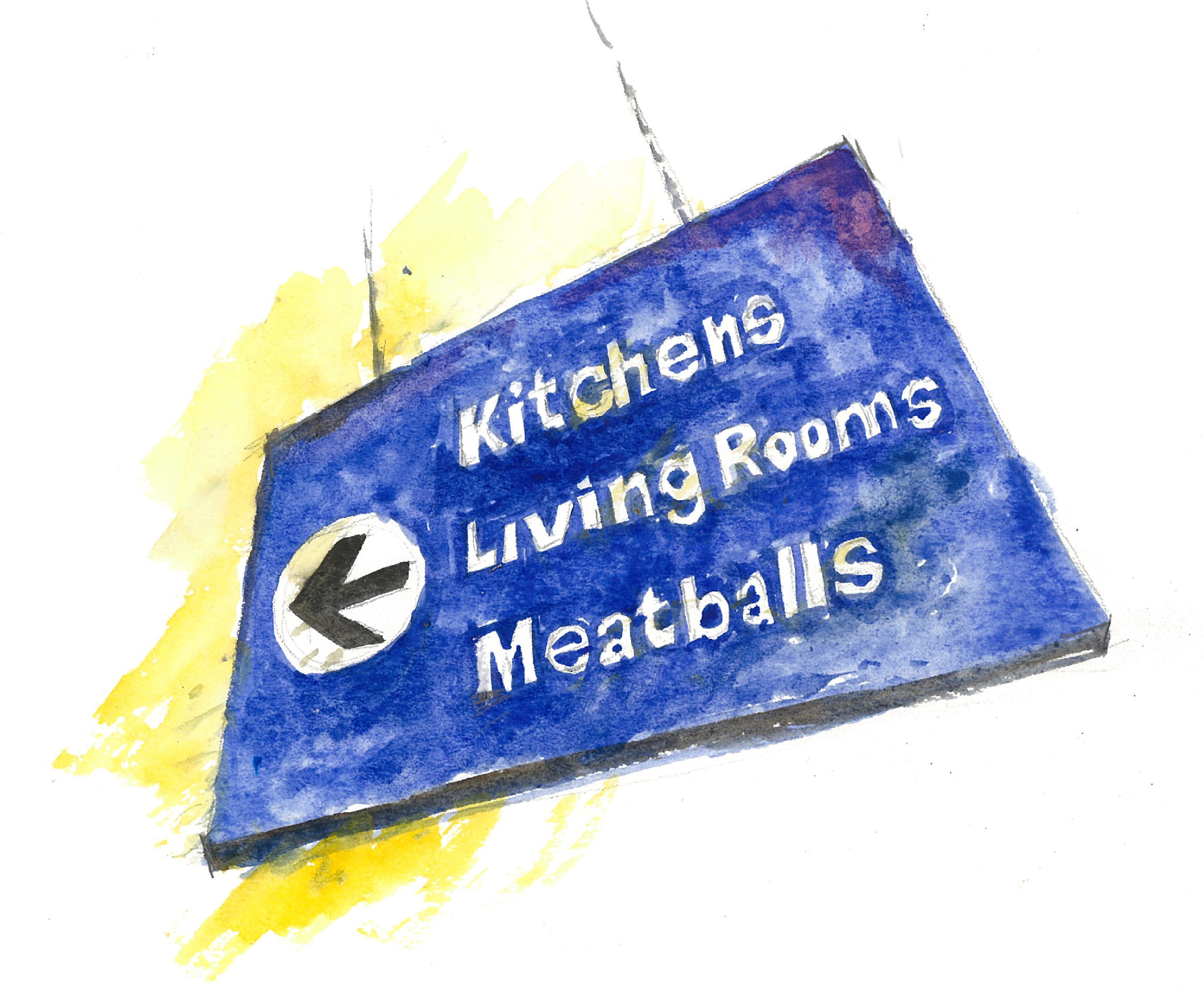
Amazingly, very few directional signs are needed to keep hundreds of shoppers moving through the vast store. Helping you stay on the straight and narrow are large Helvetica-style arrows projected onto the path at key locations – yes, virtual wayfinding signage. The few actual signs are a tasteful blue with understated, even too-small, typography.
Want to take a break from the path? Midway along the trail is Ikea’s popular and super-efficient food service where families can consider their likely purchases while dining on kottbullar, Ikeas’s famous Swedish meatballs. Hon, I say we get the Bitteraurka system in white and two of those cute Kolbjorn rugs. Then let’s head over the kitchen area, I think it’s Stop No. 8 on the map.