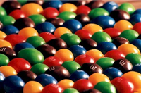
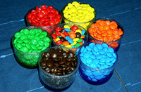
 Embodying many of the characteristics of the trendy term ‘total design,’ M&Ms are surely one of the best-designed candies. First, M&Ms are colorful, a rainbow of pure primary and secondary hues enhanced by a gleaming high gloss finish. M&Ms are modular — each piece is a perfect round and sculptural shape, but together in any quantity whether a handful or in a dish, M&Ms always make beautiful compositions.
 Physically, the candy scores, too – the pieces feel good in the hand. And, you have the hard outside/soft inside – a quality of many good foods. Don’t forget their historic slogan: melts in your mouth, not in your hand – so true, and an important design feature. M&Ms even sound good. Pour a bag into a crystal dish and just listen. Each round piece bounces off the glass making a small symphony of delightful candy klinks.
And for us graphic designers there’s even more to love. Each tiny M&M has an elegant typographic imprint in classic Century Schoolbook Bold – a pile of M&Ms is like a random arrangement of color-coded logos. The package is perfect as well – the strong dark chocolate brown with bold white letters provides understated contrast to the blizzard of color inside.
Regardless, and by any standard, M&Ms are beautifully designed, and, perhaps, the best total-design candy anywhere.


