
Planning and Designing for Our New Socially Distant World
By, John Temple
June 1, 2020
With over 40 years of strategic wayfinding design and planning experience, Hunt Design is pivoting to focus on helping clients meet the challenges of reopening for business. Visitor attractions have always been a key component of Hunt Design’s client mix. Many of the top attractions in Southern California, Florida, and throughout the world have signage designed by Hunt. All signage is designed and planned with an understanding of how each sign and message will contribute to the visitor experience.
 During this crisis those attractions must now navigate the uncertainty associated with how guests will respond to the restrictions that will be imposed for the foreseeable future. The return to “normal operations” will be a slow process and will require flexibility of staff and the public. Communicating clearly and effectively with visitors will take on a unique importance during this transition period. The level and tone of that communication will say much to the visitor about how the institution is tackling the challenge and mitigating the risks associated with reopening.
The types of messaging required for reopening fall into three categories of information. Signs will need to communicate safety information, enforce operational restrictions, and instill visitor confidence in the facility. These categories of messaging will collectively become the “voice” of the institution. Each sign sends a message to visitor about the readiness and effectiveness of the institution’s policies in reopening. Taken together, they form a powerful impression on the visitor experience.
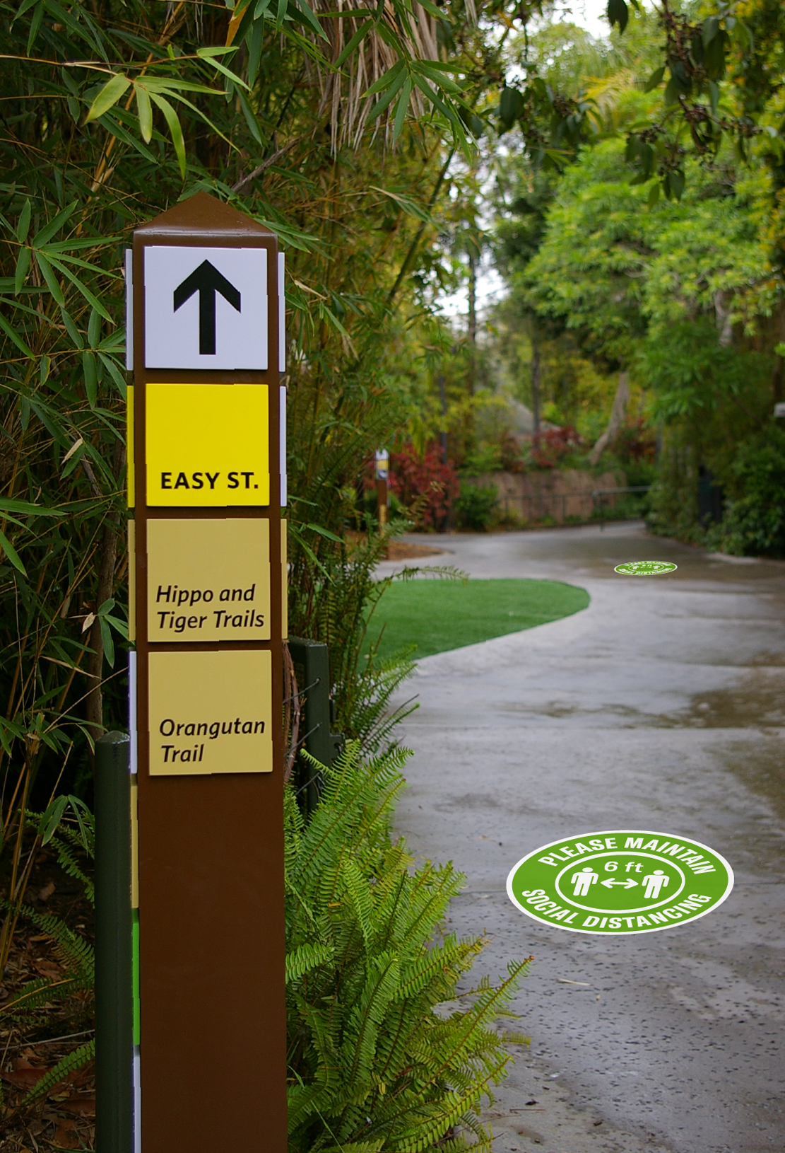
Safety signage can be thought of in terms of those messages that reinforce health authorities’ recommendations to the public. We have all become familiar with the social distancing limits of maintaining a 6 foot clear distance between people. Every grocery store and take out restaurant has tape on the floor to mark the appropriate distance that customers should maintain. Other types of safety messages include hand washing instructions, face mask requirements, and the reminders about avoiding touching one’s face. Some safety messages may be dependent on the operational decisions of the facility. If temperature checks are required for guests to enter, additional signs will be needed. Similarly, many businesses are eliminating cash transactions. In some cases, guests will need to be instructed that ticket purchases are only conducted online. Others may simply require credit card or phone payment for transactions. In either case, these policies will need to be clearly communicated.
![]() Operational signage will serve to tell visitors about the changes in how the facility is functioning. During initial phase 1 openings, many areas will be identified as “closed to the public” to avoid having too many people crowded in a limited space. Circulation changes may be implemented by the facility to ensure groups of people are moving the same direction and avoiding crossing paths too closely. In some cases, one-way signs for reopening circulation may even be counter to the permanent signage that directs visitors. Occupancy limits may need to be posted for certain areas where overcrowding can occur. Also, signs that identify changes to the normal hours of operation may be needed.
Operational signage will serve to tell visitors about the changes in how the facility is functioning. During initial phase 1 openings, many areas will be identified as “closed to the public” to avoid having too many people crowded in a limited space. Circulation changes may be implemented by the facility to ensure groups of people are moving the same direction and avoiding crossing paths too closely. In some cases, one-way signs for reopening circulation may even be counter to the permanent signage that directs visitors. Occupancy limits may need to be posted for certain areas where overcrowding can occur. Also, signs that identify changes to the normal hours of operation may be needed.
The third category of information is one that may be overlooked by 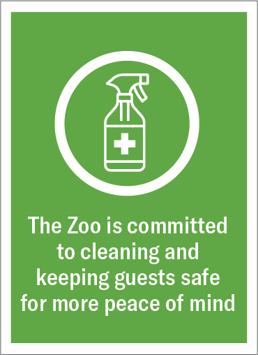 facilities who are in a hurry to quickly return to daily operations. The signs that support visitor confidence in the institution will have a big impact on the visitor experience and may help foster return visits. These types of signs communicate to the public all of the protocols that the institution is putting into place to ensure the safety of the guests and reduce risk. Notices of cleaning policies at restroom and other high-touch places fall into this category. Communicating the steps that the institution is taking to make sure its employees remain healthy is another. Visitors will feel more confident if they know there is an employee testing program in place for example. That confidence may translate into repeat visits, or to encouraging friends to visit.
 With these types of messages, it’s important that they convey the right tone to the guest. The tone of the graphics can be thought of as the symbols, typography, colors and layout working in conjunction to create the sign. The drawing style of symbols and pictograms alone can go a long way to setting the tone of the graphics. Symbols that may be perfectly appropriate in the context of a health care environment, may seem too clinical or ‘cold’ for a zoo or park. Conversely, the tone of the message that may seem right for a theme park might appear too casual and flippant in an airport terminal. And while humor can be a powerful tool in communicating, the tone of communications should be careful not to diminish the seriousness of the healthcare crisis or the risks that guests potentially are exposed to.
Hunt Design continues to help its clients find ways to help navigate through the challenges of getting back to business during this crisis. Hunt Design’s assessment services can help in determining the sign types needed, defining the messaging, setting the tone for the graphics, and applying best practices for phasing and updating.