Local Modernist Masterpiece

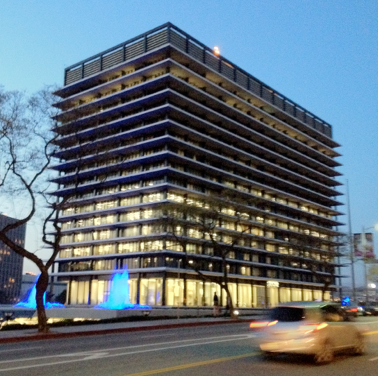
Los Angeles has its share of great buildings and here’s one of them: the headquarters of Los Angeles Department of Water & Power designed by A.C. Martin in 1961. Known as the John Ferraro Building, the elegant high-rise features a luminous vertical curtain walled volume contrasted and protected by strong… Read more »

Wayfinding Underfoot

Signs aren’t always up in the air. Here, a sculpted bronze plaque celebrating San Francisco’s historic Barbary Coast Trail is set into the sidewalk. 

Durable Logos

Durable Logos If you don’t want your logo to fade away or peel off why not cast it in, weld it on or stencil-cut it out? Integral graphic design and signs also eliminate the added-on look and suggest permanence and strength. These durable logos will last as long as the… Read more »

Canada Color

Colored Space? No. The steel columns and pots in this public building are pure white; the floor dark grey. The rainbow of rich color is light transmitted through multi-colored translucent panels. And the effect changes during the day as the sun moves around the building in downtown Montreal.

Favorite Signs No. 5

Cast in timeless bronze over ‘hand-made’ Art Deco-like letters, this handsome small sign has been part of the Salt Lake City streetscape since 1919. 10 West Broadway, Salt Lake City, Utah

Historic Sign Saved; What about the Theater?

The aging blade sign identifying the empty Rialto Theatre, recently red tagged by South Pasadena’s building and safety department, will now be repaired and for the time being remain in place towering over Fair Oaks Avenue. The 87-year-old theater has been closed since 2010 and needs substantial structural work and… Read more »

How many signs does one intersection need?

A lot, apparently. Drivers approaching this Pasadena intersection are confronted with ten(!) traffic control signs and five visible signal heads. Each sign is meant to improve safety, but taken together, we’re not so sure the opposite effect has not been inadvertently achieved.