Category: Urban

What time is it?

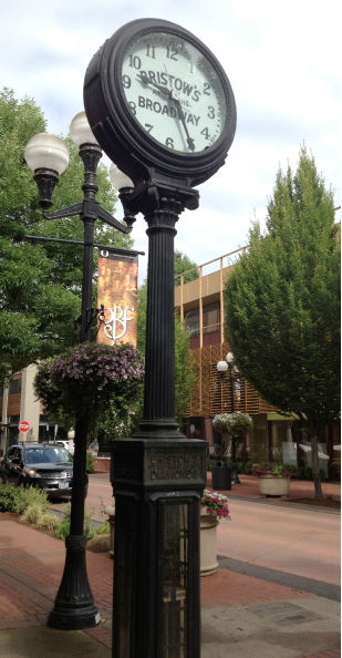
Beautiful decorative clocks once enhanced downtown streets across America. Many of these architectural-scale timepieces were installed in the public way by jewelry stores and served as advertisements for an adjacent business. But the streetscape was the beneficiary – the clocks provided intermediate scale between buildings and people and like awnings… Read more »

The Ultimate Sign–No Words Needed

Evolved from surgical signs dating back to the Middle Ages, the striped barber pole is recognizable on thousands of barbershops around the world. Whether spinning, static or even flat, the red, white and blue diagonal stripes signal a specific service.

Life Imitates Art?

A distracted man, oblivious to his public art companion, seen in Walnut Creek, California.

Is this the best sign Los Angeles can do?

While we frequently point out our favorite signs, we also feel the need to expose the not-so-good. Here, to communicate that Ninth Street becomes one-way east, the City has erected this ungainly traffic control/guide sign right in the middle of the street. Stickers, vandalism and damage don’t help the situation…. Read more »

Big Pot, Small Plant

While we like creative plantings in the urban streetscape, a pot should be in scale with its plant. It will be years until this modest palm can hold its own in this huge planter.

True Architectural Signage

Period typography and decorative lines combine to make this otherwise generic car repair building special. Unlike contemporary applied signage, these elegant ‘cast-in’ letters with ‘paint fill’ color lend both a sense of permanence and purpose. The entire building is a well-composed graphic design. Note how the forms of the E… Read more »

Color-coded Curbs

Wayfinding designers often employ color-coding to help organize information. But usually, such colors have no intrinsic meaning, only learned associations, i.e., the colors differentiating levels in a parking garage. Other colors have strong associations with expected or desired behaviors. Here we have both the learned meaning blue, for accessible parking… Read more »

Public Message Center

In the ever-increasing world of virtual information, web sites and apps, it’s nice to see and experience actual posted notices, flyers, ads posters, and other ephemera. And the color and slightly chaotic appearance adds much to the streetscape. Brown University, Providence, Rhode Island 

Signs of Seasonings

Typefaces have distinct characteristics and when used creatively they can differentiate products and even suggest personality. Here, at a sunny farmer’s market in Pasadena, California, a produce seller employs not only interesting typography, but the additional graphic design elements of borders, pattern and color to make a lively and diverse… Read more »

Perfect Urban Scale

One reason we like and feel comfortable in certain public spaces is scale – human scale. This attractive paseo in Santa Barbara, California is not only just the right size (width to height), but has all the design elements that gracefully scale-down the environment to people size. Colorful flags, awnings,… Read more »